Barchart is a fundamental tool in data visualization, offering a simple yet powerful way to present information clearly.
In this complete guide, we explore everything about barcharts — from understanding their basics to mastering advanced techniques.
Whether you are a beginner learning how to create a barchart or a professional looking for the best tools, this guide covers it all.
We also compare barcharts with other charts, highlight common mistakes to avoid, and show how to customize barcharts for better storytelling.
Additionally, you’ll discover how barcharts are evolving with technology trends like interactivity and AI integration.
If you want to enhance your data presentation skills, this detailed exploration of barchart essentials and future innovations is the perfect place to start.
Barchart Basics: Understanding the Power of Data Visualization
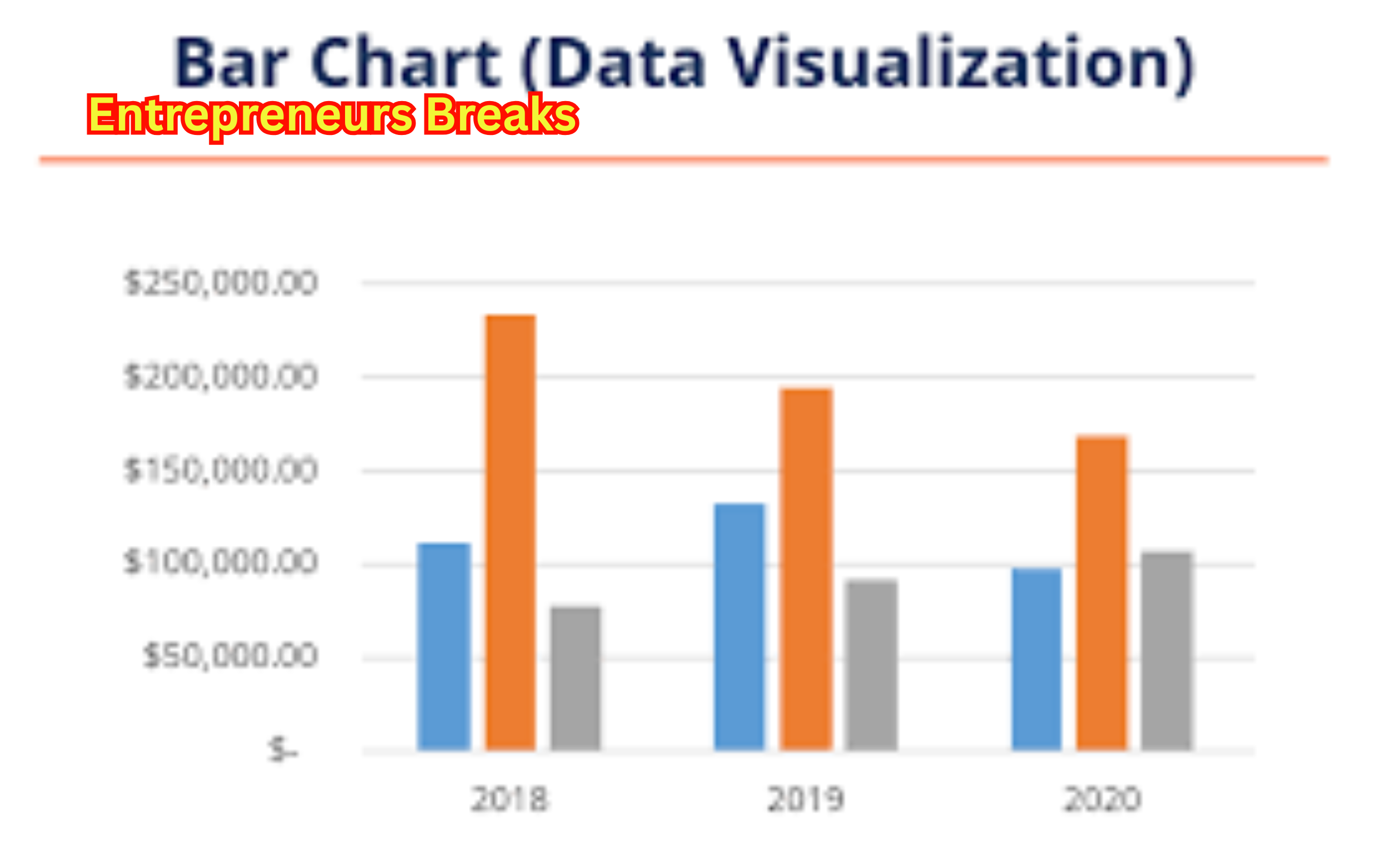
A barchart is one of the most powerful and simple tools used for data visualization.
It presents data using rectangular bars where the length of each bar is proportional to the value it represents.
Whether you’re analyzing business growth, comparing sales performance, or showing survey results, a barchart simplifies complex datasets into an easy-to-read format.
One of the greatest strengths of a barchart is its ability to make patterns and differences instantly visible.
You can use a horizontal or vertical barchart depending on the type of data and the visual impact you want to create.
Horizontal barcharts work well when category names are long, while vertical ones are perfect for quick comparisons.
Different types of barcharts include simple, stacked, and grouped barcharts, each serving a unique purpose.
Whether you’re a student, a data analyst, or a business professional, mastering the basics of barchart visualization can significantly improve your reporting and storytelling skills.
How to Create a Barchart: Step-by-Step Guide for Beginners
Learning how to create a barchart is a fundamental skill for anyone dealing with data.
It’s a straightforward process that anyone can master with a few easy steps.
The first step is collecting your data.
Make sure your categories and corresponding values are clearly defined.
Once you have your dataset, choose the right tool for creating your barchart.
Tools like Excel, Google Sheets, or even Python libraries like Matplotlib make the task simple.
Start by selecting the data range, then navigate to the ‘Insert’ tab and select the barchart option.
Customize your barchart by adjusting colors, axis labels, and titles to match your presentation style.
Always make sure your bars are proportional and your labels are clear for maximum impact.
Beginners often overlook the importance of a clean design, but it plays a huge role in delivering your message effectively.
By following these simple steps, you can create a professional and informative barchart to impress your audience.
Top 5 Tools to Design an Effective Barchart
Selecting the right tool is crucial for designing an impactful barchart.
With so many options available, it can be tricky to choose the best one.
Here’s a list of the top 5 tools you should consider:
- Microsoft Excel – One of the most popular choices for creating a quick and effective barchart. Its built-in templates make it easy for users of all levels.
- Google Sheets – Ideal for real-time collaboration and simple barchart creation, especially useful for teams working remotely.
- Tableau – A powerful data visualization platform that allows you to create highly interactive and visually appealing barcharts.
- Power BI – Microsoft’s data analysis tool offers advanced barchart customization and real-time reporting capabilities.
- Python (Matplotlib and Seaborn Libraries) – Best suited for programmers and data scientists who want complete control over their barchart designs.
Each tool offers different features depending on your need for simplicity, interactivity, or deep data analysis.
Choosing the right one ensures your barchart communicates your data effectively.
Barchart vs Line Chart: Key Differences Explained
Understanding the difference between a barchart and a line chart is critical when choosing the right method to present your data.
Both are popular, but they serve different purposes.
A barchart is ideal for comparing discrete categories or groups, such as sales by region or student scores by subject.
Each bar’s height or length represents the size of the value, making it easy to compare individual items visually.
On the other hand, a line chart is better suited for showing trends over time, like tracking stock prices or website traffic over months.
Instead of individual bars, it uses a series of data points connected by lines to depict progression.
When clarity and comparison are your priorities, a barchart is the better option.
If you want to highlight changes over time or continuous data, then a line chart is more appropriate.
Knowing when to use a barchart versus a line chart ensures your data story is clear and compelling.
Why Barchart is Essential for Business Analytics
In the world of business analytics, the barchart plays a pivotal role.
It simplifies the interpretation of complex datasets, helping decision-makers spot trends, anomalies, and opportunities quickly.
Whether you’re presenting quarterly profits, market share comparisons, or employee performance, a barchart can convey insights more powerfully than rows of numbers.
A well-designed barchart enables businesses to make data-driven decisions faster.
For example, a sales manager can instantly identify which product line is underperforming just by glancing at a barchart.
Similarly, HR departments use barcharts to analyze workforce demographics and performance metrics.
Moreover, executives often prefer visual reports over lengthy spreadsheets.
Incorporating barcharts into business dashboards improves communication and aids in strategic planning.
In today’s fast-paced environment, mastering the art of presenting data visually with a barchart is not just a skill—it’s a business necessity.
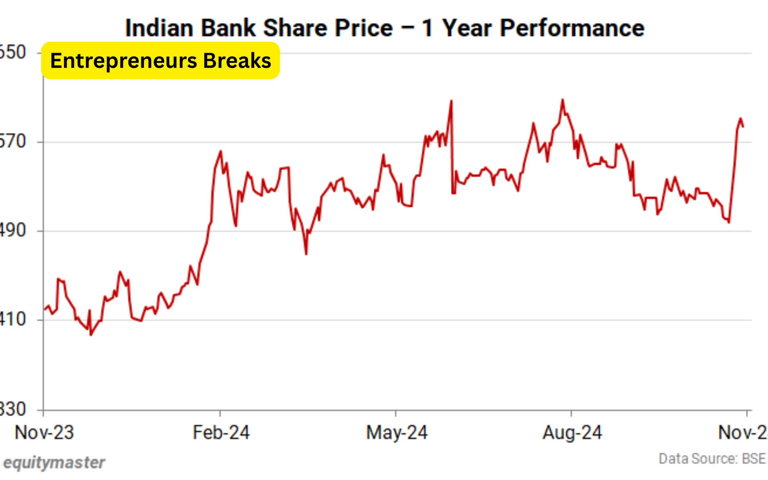
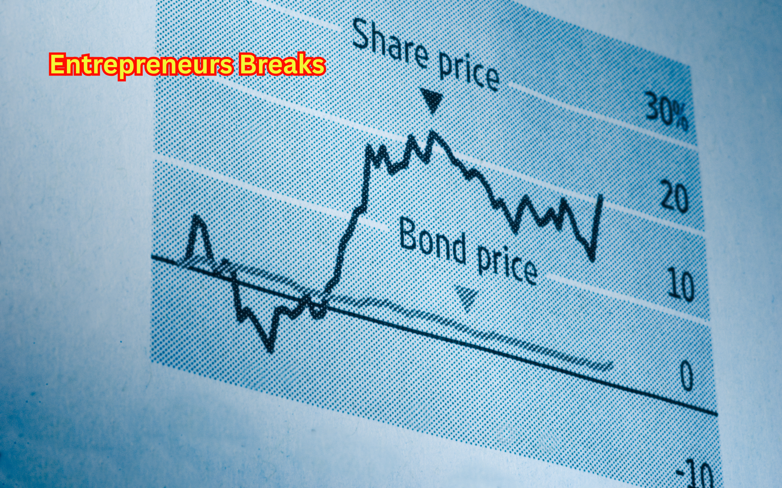
Barchart Applications in Stock Market Analysis
The barchart is extensively used in stock market analysis to represent price movements, trading volumes, and technical patterns.
Traders and analysts rely on barcharts to make informed buying or selling decisions.
In technical analysis, a barchart typically shows the opening, high, low, and closing prices of a stock within a specific time frame.
This type of barchart, known as an OHLC (Open-High-Low-Close) chart, provides a comprehensive view of market behavior.
Barcharts also help investors compare the performance of different stocks or sectors at a glance.
Instead of wading through complex tables, a barchart can visually depict which stocks are gaining or losing ground, making analysis more efficient.
Moreover, trading platforms like TradingView and Barchart.com offer real-time barchart representations for quick decision-making.
For anyone involved in the stock market, understanding how to read and interpret a it is crucial for success.
Common Mistakes to Avoid While Creating a Barchart
Even though creating a barchart seems easy, many common mistakes can reduce its effectiveness.
One frequent error is using inconsistent scales, which can distort data interpretation.
Always ensure your axis scales are appropriate and proportional.
Another mistake is cluttering the barchart with too much information.
Overloading it with labels, colors, or data points makes it difficult for viewers to focus on the key message.
Keeping the design simple and clean is essential.
Also, avoid using 3D effects unnecessarily.
While they might look fancy, they can make bars harder to read and mislead the viewer.
Incorrect color schemes, such as using colors that are too similar, can also confuse the audience.
Finally, always label your axes clearly and include units if necessary.
A great it tells a story quickly and clearly—don’t let design mistakes dilute your message.
Customizing Your Barchart for Better Data Presentation
Customizing a barchart ensures your data presentation is both professional and effective.
Basic customization includes adjusting bar colors to represent different categories or emphasize key data points.
Consistent and contrasting color schemes can significantly enhance readability.
You can also customize fonts, axis labels, and gridlines to suit your audience.
For instance, larger fonts might be necessary if the it will be displayed on a projector during a presentation.
Data labels can be added directly on the bars for easier reading.
Stacked or grouped barcharts offer deeper insights when dealing with multiple variables.
Adding a legend helps viewers understand your customization choices.
Interactive features like tooltips or clickable bars are useful for digital dashboards.
By thoughtfully customizing your it, you can guide your audience’s attention to the insights that matter most, making your presentation more impactful.
Interactive Barchart: Enhancing User Engagement with Dynamic Graphs
An interactive barchart is a modern way to keep users engaged with your data.
Unlike static charts, interactive barcharts allow viewers to hover, click, or zoom in on data points to get more detailed information.
Platforms like Tableau, Power BI, and D3.js make creating interactive barcharts easy and intuitive.
These barcharts are particularly useful in dashboards, financial reports, and online articles where user engagement is crucial.
Interactive features like drill-downs (where clicking a bar reveals deeper levels of data) add tremendous value to your data storytelling.
They allow users to explore datasets in a non-linear and intuitive manner.
Whether you’re showcasing business metrics or survey results, using an interactive it keeps your audience curious and involved.
In today’s digital-first environment, adding interactivity to your it can significantly elevate your data presentation skills.
Future Trends in Barchart Design and Visualization Technology
The future of barchart design is evolving rapidly alongside technological advancements.
Artificial Intelligence (AI) and Machine Learning (ML) are playing an increasing role in auto-generating smarter, more intuitive barcharts based on real-time data inputs.
Another trend is the integration of augmented reality (AR) and virtual reality (VR) into data visualization, where barcharts can be experienced in 3D environments.
This offers an immersive way to understand complex datasets.
Minimalistic design remains a key trend, with a focus on clean layouts and emphasis on storytelling.
Future barcharts will also prioritize accessibility, ensuring charts are readable by people with color blindness and other visual impairments.
Real-time dynamic barcharts are becoming common, especially in financial services where instant updates are critical.
As technology progresses, the humble it will become even more powerful, interactive, and user-centric.
Conclusion
The barchart remains a cornerstone of effective data visualization, whether for business analytics, stock market analysis, or simple presentations.
From basic creation to advanced interactive designs, mastering it can drastically enhance your ability to communicate complex information clearly.
As technology evolves, the future of it design promises more interactivity, accessibility, and visual appeal.
By avoiding common mistakes, customizing intelligently, and choosing the right tools, anyone can craft a compelling story with data.
Whether you’re a student, a business leader, or a data scientist, understanding the true power of it will always give you an edge in making impactful, data-driven decisions.


Leave a Reply